Section – The “Section” control is a formatting control that allows you to create a rectangular section or area on the page into which you can drag other controls such as text. Images, video and more. The “Section” control can have visible outline borders or be completely invisible but it’s primary purpose is to provide you with granular control over the margins, padding and formatting of an area as a container and enable you to format the position of objects within it.
Properties
- Title: Enter a label for your section within this field to help you identify the section (e.g. ‘Product Basic Information Section’)
- Padding: The “Padding” property allows you to set the padding around the rectangular section area from the top, bottom, left and right. All values are in pixels.
- Margin: The “Margin” property allows you to set the margin distances within the rectangular area from the top, bottom, left and right. All values are in pixels.
- Background Color: Select the color picker within this field to set the background color of the rectangular section area.
- Alignment: Select the dropdown within this field to set the alignment of the rectangular section area and position it to the left, right or center of the page. All controls placed within the section will also be aligned according to this setting unless they have an alignment setting of their own which would take precedence.
- Border: Set the border thickness (in px), style and color to create a visible border around the rectangular section area.
- Border Radius: Set the radius for the top left, top right, bottom left and bottom right corners of the border to achieve a rounded rectangle border effect. All values in pixels.

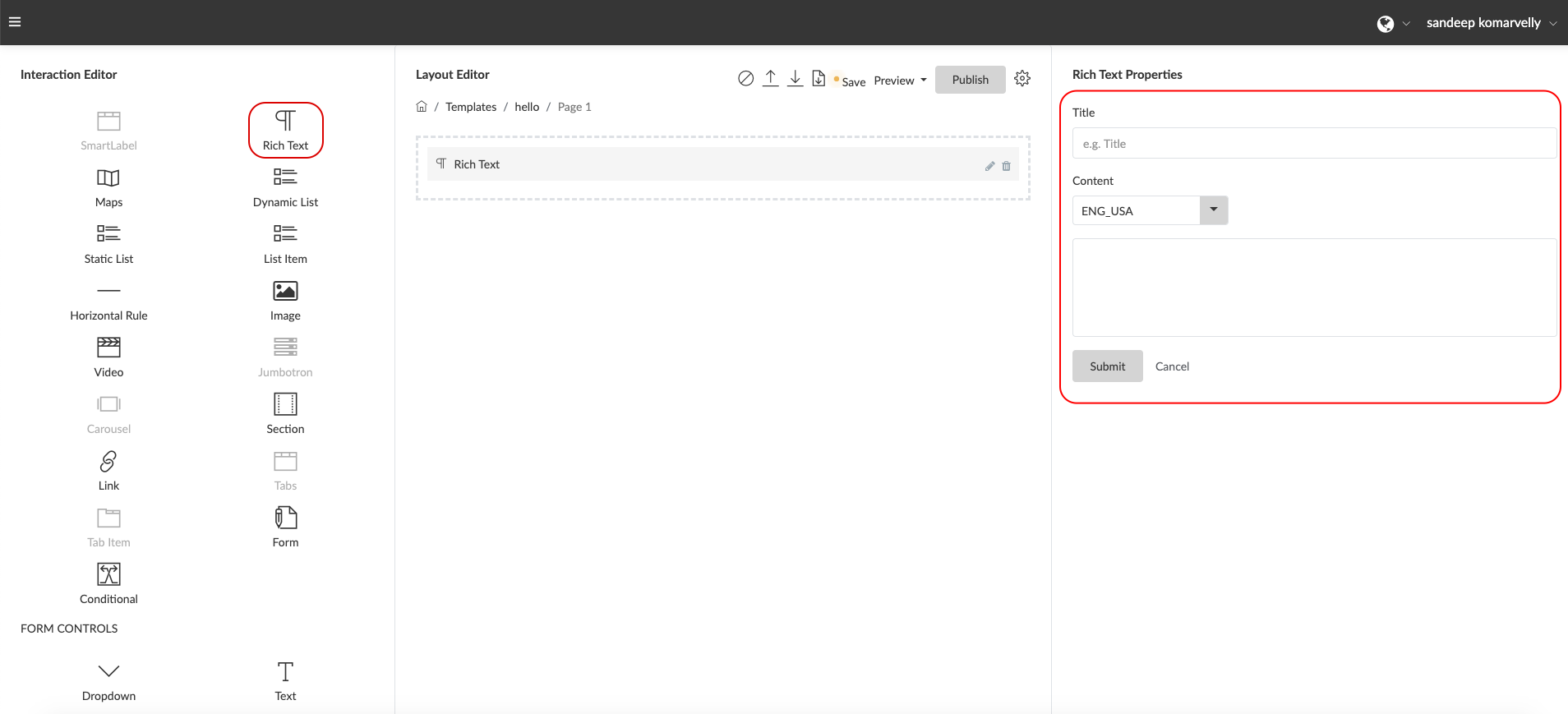
Rich Text – The “Rich Text” control is a feature rich text editor control for adding and formatting and displaying text information and dynamic text based data values from within the connected Entity instance / Thing through the use of attribute shortcodes. Static text which needs to be displayed within the “Visual Interaction” can simply be keyed in and formatted for font, colors, text styles, alignment or more. Dynamic values which need to be displayed from the “Thing” data can be done by selecting the appropriate “attribute shortcode” from the dropdown available within the editor. When the template is applied to a “Thing” in order to create an interaction, this “attribute shortcode” placeholder will be replaced by the actual value of the data from the “Thing”. (e.g. The shortcode {{EI.data.NetContent}} will be replaced by the actual value for Net Content such as ‘115 g’)
Properties
- ShortCode: Denoted by an [S] icon, this control displays a dropdown selector with all the attributes within the “Entity” your Visual Interaction Template is connected to. On selecting an attribute, the control will automatically place a shortcode for that attribute in the text editor which will be replaced by the actual attribute value when the Visual Digital Interaction is invoked. Note: If your template is connected to an “Entity” as the source of data for that template, then the attributes for that entity will be displayed. If your template is connected to a “Custom API” as a source of data, then the attributes available within that Custom API will be displayed.
- Bold: This option enables you to apply “Bold” styling for the selected text.
- Italic: This option enables you to apply “Italic” styling to the selected text.
- Underline: This option enables you to “Underline” the selected text.
- Strikethrough: This option enables you to “Strikethrough” the selected text.
- Subscript: This option enables you to convert the selected text into a “Subscript” format.
- Superscript: This option enables you to convert the selected text into a “Superscript” format.
- Align Left: This option aligns the selected text to the “Left”
- Align Center: This option aligns the selected text to the “Center”
- Align Right: This option aligns the selected text to the “Right”
- Align Justify: This option justifies the text alignment to spread across the paragraph area evenly.
- Ordered List: This option enables you to create an ordered list format
- Ordered List Style: This option enables you to change the style of the ordered list and create lettered ordering, numbered ordering, roman numeral ordering and so on.
- Unordered List: This option enables you to create an unordered bullet point style list with the options of selecting the style of bullets you wish to display.
- Title: This field is used to set a label for the rich text area to help you identify it (e.g. ‘Caution & Warnings Information Text’)
- Font Family: This option enables you to change the “Font” for the selected text
- Font Size: This option enables you to change the “Font Size” of the selected text. The size value options are displayed in points.
- Text Color: This option enables you to select a font color for the selected text.
- Text Highlight Color: This option enables you to select a font highlight color for the selected text.
- Clear Formatting: This option allows you to clear all formatting applied to the selected text.
- Paragraph Format: This setting allows you to to select text and set a pre-formatted Heading style or Paragraph text style.
- Paragraph Style: This option allows you to select an apply a predefined style to the selected paragraph for example “upper case”, “bordered” and “spaced”.
- Line Height: This option allows you to set the height and spacing of selected lines of text.
- Decrease Indent Paragraph: This option enables you to increase the indent for a selected paragraph.
- Increase Indent Paragraph: This option enables you to decrease the indent for a selected paragraph.
- Quotes: This option enables you to set and style the selected text as quoted text and alter the size of the quotes.
- Insert Link: This option enables you to add a URL hyperlink to the selected text.
- Insert Table: This option enables you to generate an HTML table by selecting the number of rows and columns required in the grid and clicking to confirm. The tables created can be selected and right clicked to bring up formatting options for the table.
- Insert Horizontal Line: This option places a horizontal ruled line in the editor.
- Fullscreen: This option maximizes the editor window to a full screen view. Clicking on the the Fullscreen icon a second time will restore the window view of the editor.
- Code View: This option enables you to add HTML code and tags within the editor or simply view everything in plain HTML.

Image – The “Image” control is used to display an image within the “Visual Interaction Template” which can either be a static image uploaded directly to the template or dynamic and come from the image data of a “Thing”.
Properties
- Title: Enter a label for your image within this field to help you identify the image (e.g. ‘Item Packaging Image’)
- Alt Text: Enter the ALT Text meta tag for the image within this field
- Height: Set the image height in pixels within this field
- Width: Set the image width in pixels within this field
- Scale: Enables you to scale the image size by percentage of its maximum full dimensions. The image can be scaled to 25%,50%,75% or 100% of its original size.
- Alignment: Select the dropdown within this field to set the alignment of the image and position it to the left, right or center of the container its in. If this Alignment property is set, it will take precedence over any Alignment property applied on any section or container the image is placed in.
- Source: This field specifies the source for the image to be displayed and can be set to :
- Upload Image: In order to upload and display a static image within the template uploaded from your device. Select a language code and click on “Browse Images” to select an image from your device or drag and drop an image from your device into the container to upload.
- From Entity Instance: In order to display a dynamic image which comes from the “Thing” / “Entity Instance” data, select this option. Then, specify the path for the image attribute you wish to pull the image URL data from (e.g. data.productImage)
- External URL: In order to display a static image located outside the system, please select this option. Then, add the full URL path for the image (e.g. ‘https://www.image-source.com/product-image.jpg’) A different image URL can be added for each language using the language selector dropdown beside it.

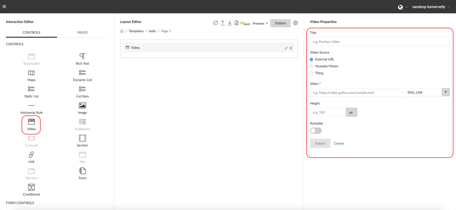
Video – The “Video” control is used to display video content within the “Visual Interaction Template” which can either be static Video hosted on an external site, a static video hosted on YouTube or Vimeo or a dynamic video sourced from a “Thing” where the path of the video attribute is specified in order to retrieve the URL from the attribute.
Properties
- Title: Enter a label for your video within this field to help you identify the video (e.g. ‘Preparation Instructions Video’)
- Width: Set the video frame width in pixels within this field
- Height: Set the video frame height in pixels within this field
- Source: Select the source of the video file. The video file can come from an External URL which can be placed in the “Video*” input box below. It can come from YouTube or Vimeo and the URL from these sites can be placed in the “Video*” input box below. Lastly, it can come from a “Thing” and the attribute path for the attribute can be defined the “Thing Mapping to Video” input below.
- Click on the multi-select field and select the language / languages you would like this video link to be enabled for.
- Autoplay: Toggle this option on if you would like the video to automatically start playing on page load.
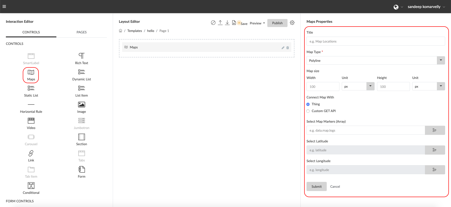
Maps – The “Maps” control is used to display one or more locations within a “Visual Interaction Template” and these locations are dynamically displayed from a “Thing” data attribute which stores latitude and longitude coordinate data.
Properties
- Title: Enter a label for your map within this field to help you identify the map (e.g. ‘Item Trace Route’)
- Map Type: This field allows you to select the styling of the map. Select “Polyline” to display a map where the location markers on the map are connected with a line to represent movement or route or select “Markers” to display a map with individual location markers not connected with lines.
- Height: Set the map area height in pixels within this field (e.g. ‘400’)
- Width: Set the map area width in pixels within this field (e.g. ‘650’)
- Data Mapping: This section contains the properties that enable you to connect the map control to a data source.
- Source: Select the source for the data that will be displayed by the maps control. Select “Entity Information” in order to connect the control and source the data directly from a “Thing” or “Entity Instance” created within the system. Alternatively, select “Custom Get API” to connect the maps control via a “Custom API Flow” created within the system.
- Map Markers Array: Specify the attribute name and path which stores the location information log that will be displayed as map markers (e.g. ‘data.map.logs’)
- Latitude Key: Specify the attribute key and path for the Latitude marker (e.g. ‘data.map.logs.latitude’)
- Longitude Key: Specify the attribute key and path for the Longitude marker (e.g. ‘data.map.logs.longitude’)
- Click the “Submit” button to save your changes.
Forms – The “Form” control is designed to create short information collection forms or questionnaires tied to a template and not connected directly to an individual “Thing” in any way. The control is ideal for creating brief feedback forms, questionnaires, surveys, contests and similar use cases.
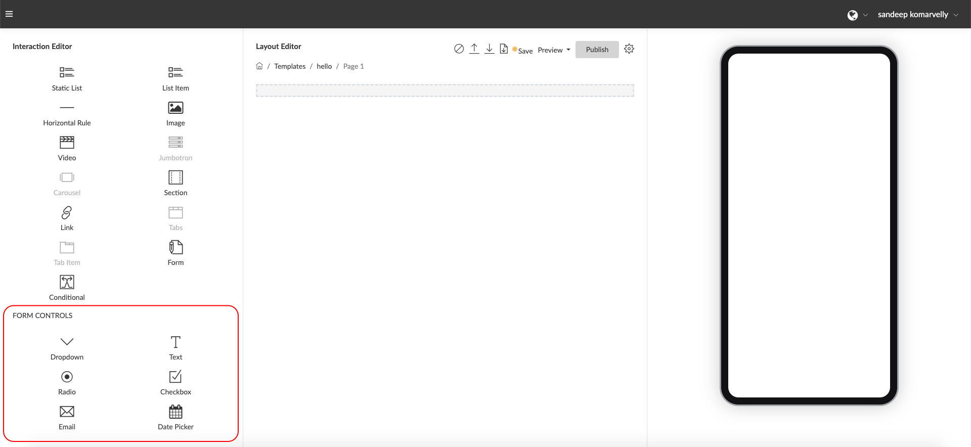
Form Controls – A set of “Form Controls” have been provided to work in conjunction with the “Form” control and can only be dragged into a template design “within” a Form. In order to create a form, drag the “Form” control into the “Layout Editor” (Dragging in a “Section” control first and then dragging a “Form” control into it will offer greater control over formatting and style). Once the “Form” control has been added to the Layout, individual “Form Controls” can be dragged and dropped into the “Form” to generate the questions.
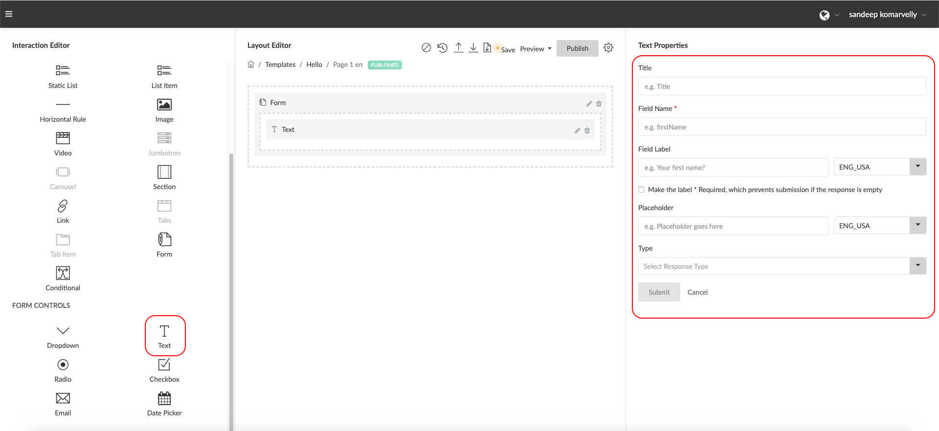
Text -This control allows you to create a simple text input form field with the additional ability to have some pre configured validations for email formats, numeric formats, hyperlinks or URLs and larger text inputs.
Properties
- Title: Enter a label for your Text Input within this field to help you identify the Text Input or question (e.g. ‘Name Field’). This is not displayed to end users.
- Field Name: Enter a field name without spaces or special characters to define a free form attribute to store the values input by the users. (e.g. firstName). This is used internally by the system and not displayed to the end users.
- Field Label: Enter a form field label or question the end user will see just above the text input. (e.g First Name) or (e.g. What is your first name?)
- Make this field Required*: Check this box if you would like to make this field mandatory. Click on the multi-select field and select the language / languages you would like the Field Label to be enabled for.
- Placeholder: Enter placeholder text here to help provide more context to the user. This will be displayed in a light font as an example within the input field. Click on the multi-select field and select the language / languages you would like this text to be enabled for.
- Type: Select the type of input you expect from the user for this field. This will apply some validation to check the format before submitting the information. (e.g. If “email” is selected, the system will check for a valid email format)
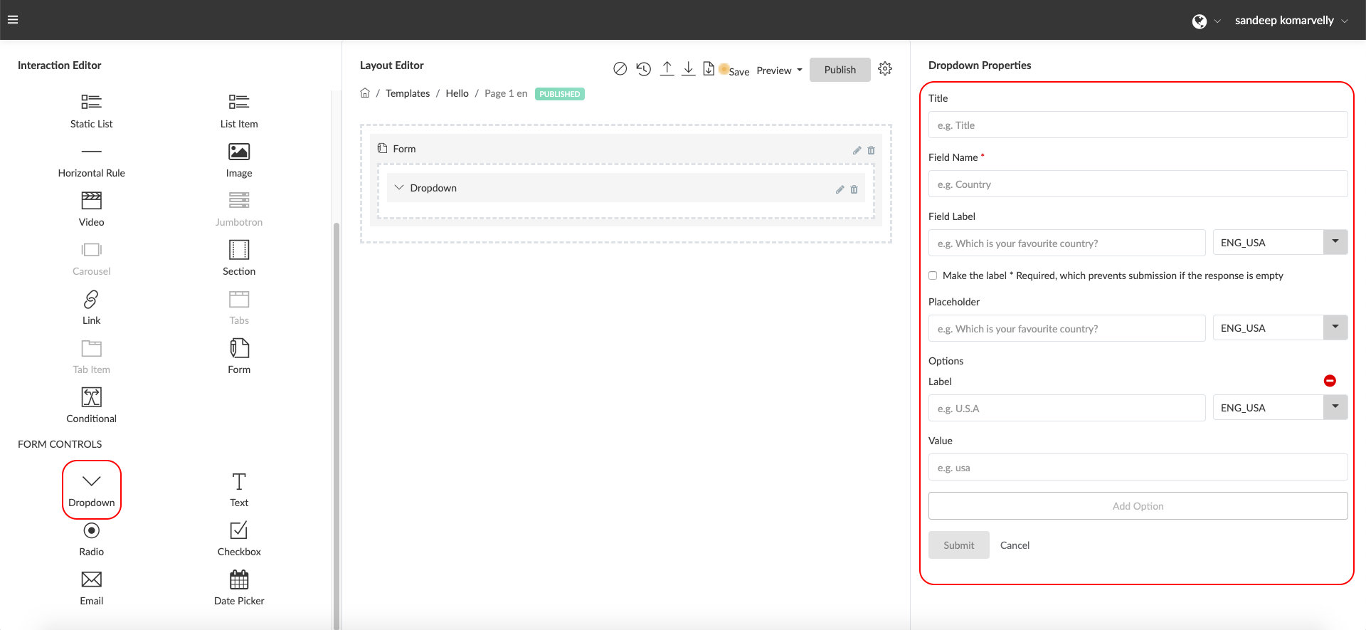
Dropdown -This control allows you to create a dropdown / select input form field with one or more pre-configured values to select from. (e.g. Which city are you from? Select from the dropdown below.)
Properties
- Title: Enter a label for your Dropdown within this field to help you identify the field or question (e.g. ‘Country Select Field’). This is not displayed to end users.
- Field Name: Enter a field name without spaces or special characters to define a free form attribute to store the values input by the users. (e.g. firstName). This is used internally by the system and not displayed to the end users.
- Field Label: Enter a form field label or question the end user will see just above the text input. (e.g Select your country) or (e.g. Where are you located?). Click on the multi-select field and select the language / languages you would like the Field Label to be enabled for.
- Make the label * Required: Check this box if you would like to make this field mandatory.
- Placeholder: Enter placeholder text here to help provide more context to the user. This will be displayed in a light font as an example within the input field. Click on the multi-select field and select the language / languages you would like the text to be enabled for.
- Options Label: Enter a label for the user to view and select from within the dropdown. (e.g. “United States”). This will be displayed within the drop down the user sees. Click on the multi-select field and select the language / languages you would like the Label to be enabled for.
- Options Value: Enter the actual value sent to be stored in the responses data when the user selects an option. (e.g. “USA”). The value can be the same as the label or different if you wish to store a different value for the response within the data.
Radio -This control allows you to create a set of radio button options from which the user can select a single option. (e.g. “How easy was this form to use? Please select one option”)
Properties
- Title: Enter a label for your Radio options list within this field to help you identify the field or question (e.g. ‘Easy of Use Field’). This is not displayed to end users.
- Field Name: Enter a field name without spaces or special characters to define a free form attribute to store the values input by the users. (e.g. easeOfUse). This is used internally by the system and not displayed to the end users.
- Field Label: Enter a form field label or question the end user will see just above the text input. (e.g “How easy was this form to use? Please select one option”). Click on the multi-select field and select the language / languages you would like the Field Label to be enabled for.
- Make the label * Required: Check this box if you would like to make this field mandatory.
- Options Label: Enter a label that will appear to the user for this Option (e.g. “Very Easy to Use”). This will be displayed next to the Radio option and is seen by the user. Click on the multi-select field and select the language / languages you would like the text to be enabled for.
- Options Value: Enter the actual value sent to be stored in the responses data when the user selects an option. (e.g. “EASY”). The value can be the same as the label or different if you wish to store a different value for the response within the data.

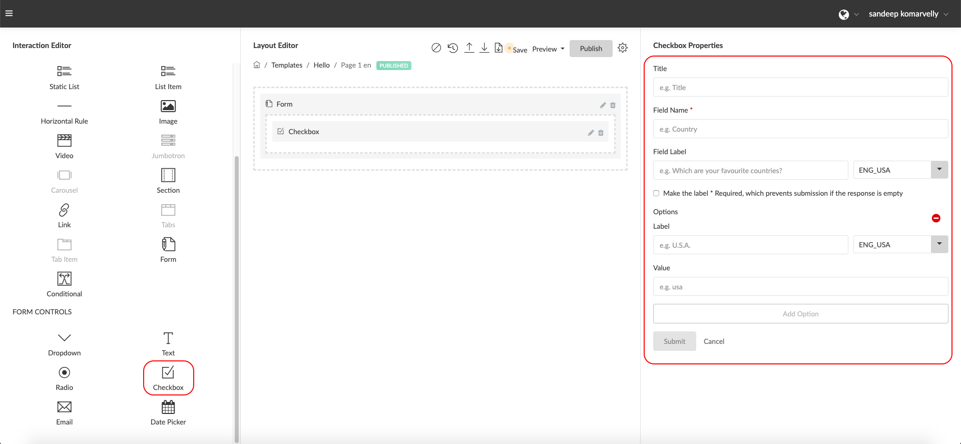
Checkbox -This control allows you to create a set of options from which the user can select one or more options from. (e.g. “Select the industries your business caters to”)
Properties
- Title: Enter a label for your Checkbox list within this field to help you identify the field or question (e.g. ‘Industries Field’). This is not displayed to end users.
- Field Name: Enter a field name without spaces or special characters to define a free form attribute to store the values input by the users. (e.g. targetIndustries ). This is used internally by the system and not displayed to the end users.
- Field Label: Enter a form field label or question the end user will see just above the text input. (e.g “Which industries do you target? Please select all industry segments that apply”). It is multilingual field
- Make the label * Required: Check this box if you would like to make this field mandatory.
- Options Label: Enter a label that will appear to the user for this Option (e.g. “Manufacturing Industry”). This will be displayed next to the Checkbox option and is seen by the user. Click on the multi-select field and select the language / languages you would like the text to be enabled for.
- Options Value: Enter the actual value sent to be stored in the responses data when the user selects an option. (e.g. “MANUFACTURING”). The value can be the same as the label or different if you wish to store a different value for the response within the data.
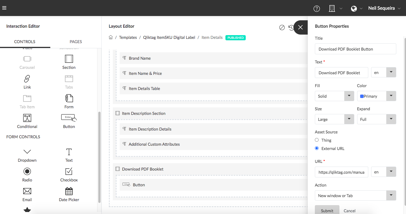
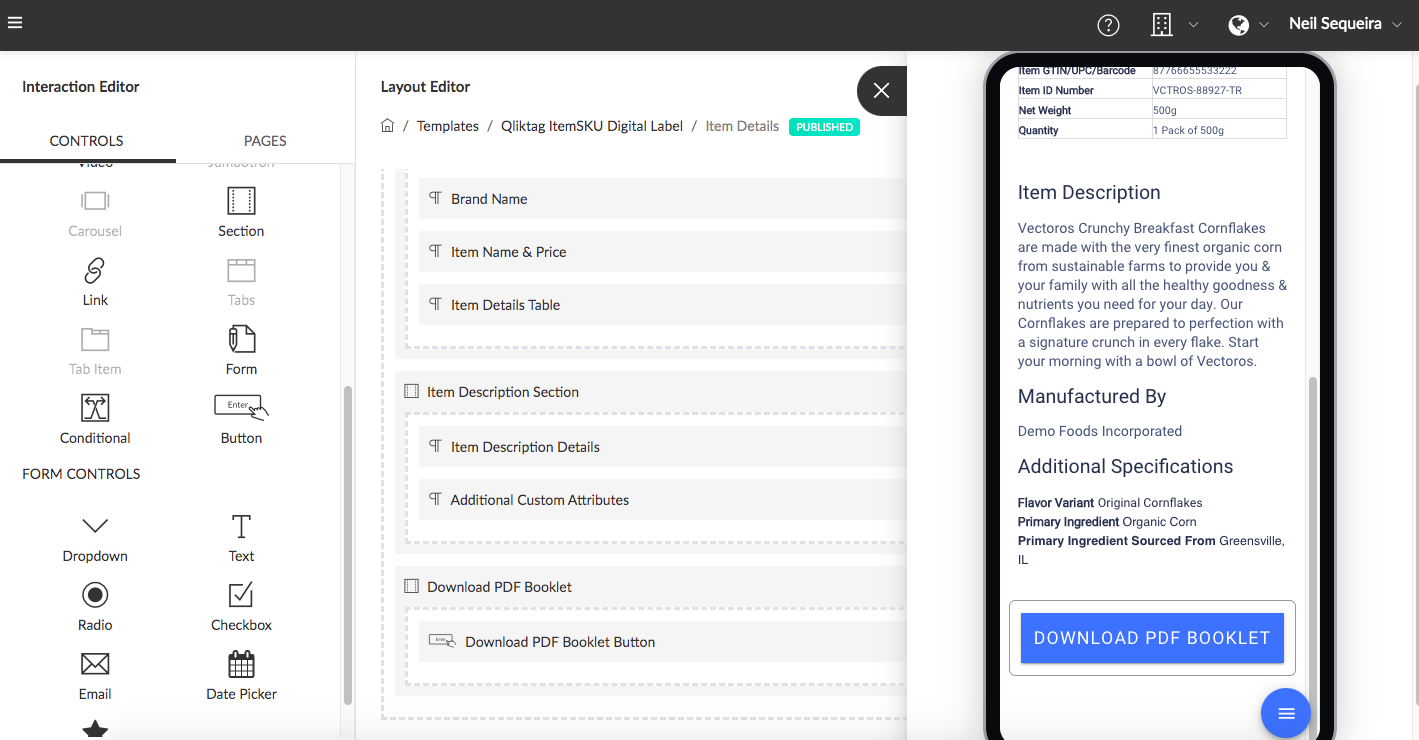
Button – The “Button” control is used essentially as a visual link / URL hyperlink within the Visual Interaction Template to either:
1)Provide a button link to navigate to / download from an external web URL / File / Web Page
2)Provide a button link to navigate to / download from an internal file or URL stored within a “Thing” attribute
For example: a button control maybe used to allow a user to navigate to the company website by linking the button directly to the URL for the company website. The button can also be used to allow the user to download a User Instructions PDF document if the link to that document is stored within a Thing.
Properties
- Title: Enter a label for your button within this field to help you identify the button (e.g. ‘PDF Booklet Download Button’)
- Text: This is the text that will appear on the button as the label. The text can be multi-lingual and can be entered in multiple languages as required.
- Fill: This property defines the style of the button and based on what is selected in the dropdown will display a clear button, a solid button or an outline style button.
- Color: This property allows you to select and define the color of the button based on certain preloaded color options available in the dropdown.
- Size: This property allows you to set the size of the button as either default, small or large by selecting from the dropdown.
- Expand: This property allows you to expand the width of the button to either default, fit the block it is contained in or stretch full width to fill the container width.
- Asset Source: This property allows you to select ‘where’ the button should locate its target URL. Select ‘External URL’ if you have an external web URL you would like the button to point to. Select ‘Thing’ and proceed to select the attribute from the Entity that you would like the button to point to if you would like the target to be a dynamic web URL or document link stored within an asset data type attribute.
- Action: This property lets you select whether to open/download the link in the same browser window or open within a new tab in the browser when the button is clicked. Note: some browsers for security reasons may open a document link within a new tab by default and not directly download a document file for security reasons.
- Submit: Click ‘Submit’ to save the changes
