FORMS
Forms – There are 3 types of forms which can be created within the Digital Interaction or Experience each with a distinct purpose and functionality.
- Feedback / Survey Forms
- Thing Update Request Forms
- Thing Array Update Request Forms
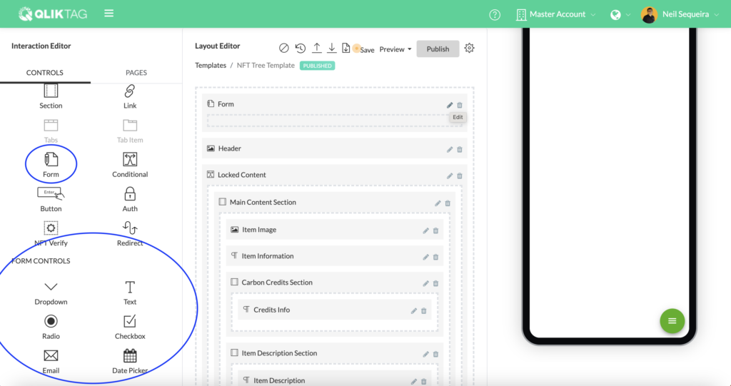
They can all be created by dragging the Form control into the Layout Editor, however the configuration of each is different and may require additional steps and configuration.
Feedback / Survey Forms
The “Feedback / Survey Form” type is designed to create short information collection forms or questionnaires tied to a template and not connected directly to an individual “Thing” in any way. The control is ideal for creating brief feedback forms, questionnaires, surveys, contests and similar use cases which can then be downloaded in the form of a csv spreadsheet to review data or responses collected.
Form Controls – A set of “Form Controls” have been provided to work in conjunction with the “Form” control and can only be dragged into a template design “within” a Form. In order to create a form, drag the “Form” control into the “Layout Editor” (Dragging in a “Section” control first and then dragging a “Form” control into it will offer greater control over formatting and style). Once the “Form” control has been added to the Layout, individual “Form Controls” can be dragged and dropped into the “Form” to generate the questions.
Text -This control allows you to create a simple text input form field with the additional ability to have some pre configured validations for email formats, numeric formats, hyperlinks or URLs and larger text inputs.
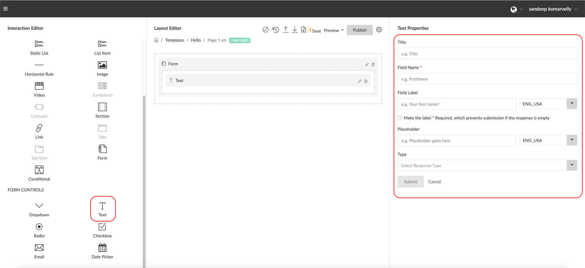
Properties
- Title: Enter a label for your Text Input within this field to help you identify the Text Input or question (e.g. ‘Name Field’). This is not displayed to end users.
- Field Name: Enter a field name without spaces or special characters to define a free form attribute to store the values input by the users. (e.g. firstName). This is used internally by the system and not displayed to the end users.
- Field Label: Enter a form field label or question the end user will see just above the text input. (e.g First Name) or (e.g. What is your first name?)
- Make this field Required*: Check this box if you would like to make this field mandatory. Click on the multi-select field and select the language / languages you would like the Field Label to be enabled for.
- Placeholder: Enter placeholder text here to help provide more context to the user. This will be displayed in a light font as an example within the input field. Click on the multi-select field and select the language / languages you would like this text to be enabled for.
- Type: Select the type of input you expect from the user for this field. This will apply some validation to check the format before submitting the information. (e.g. If “email” is selected, the system will check for a valid email format)
Dropdown -This control allows you to create a dropdown / select input form field with one or more pre-configured values to select from. (e.g. Which city are you from? Select from the dropdown below.)
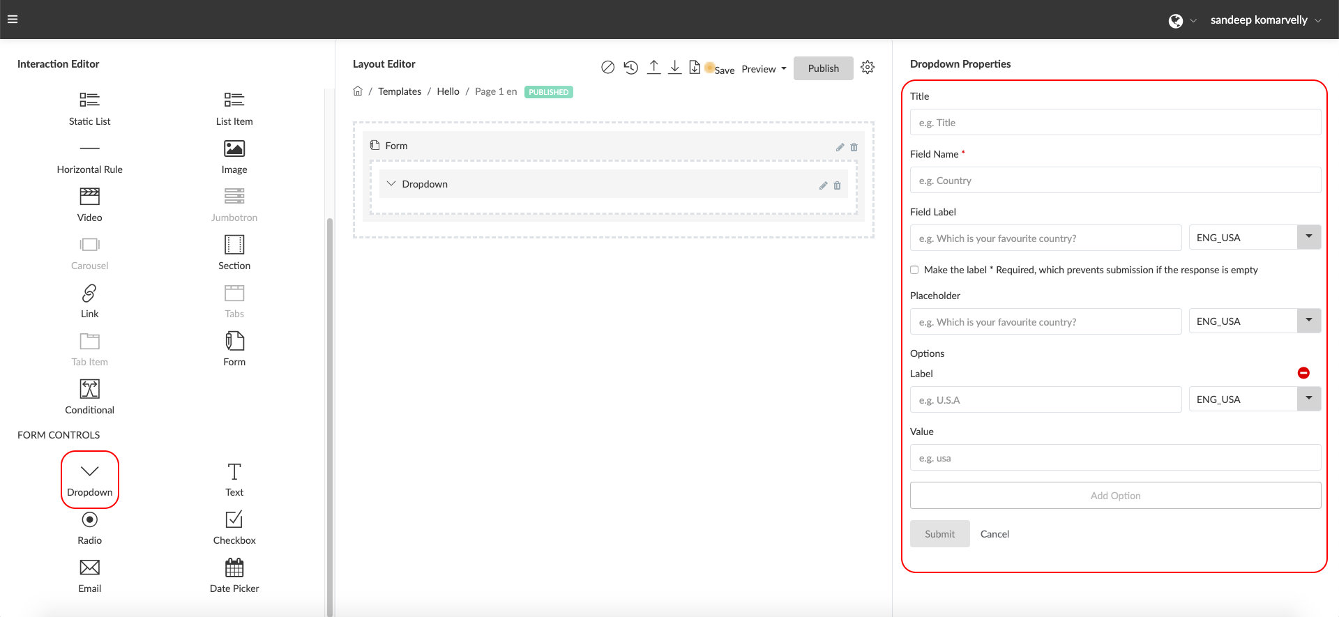
Properties
- Title: Enter a label for your Dropdown within this field to help you identify the field or question (e.g. ‘Country Select Field’). This is not displayed to end users.
- Field Name: Enter a field name without spaces or special characters to define a free form attribute to store the values input by the users. (e.g. firstName). This is used internally by the system and not displayed to the end users.
- Field Label: Enter a form field label or question the end user will see just above the text input. (e.g Select your country) or (e.g. Where are you located?). Click on the multi-select field and select the language / languages you would like the Field Label to be enabled for.
- Make the label * Required: Check this box if you would like to make this field mandatory.
- Placeholder: Enter placeholder text here to help provide more context to the user. This will be displayed in a light font as an example within the input field. Click on the multi-select field and select the language / languages you would like the text to be enabled for.
- Options Label: Enter a label for the user to view and select from within the dropdown. (e.g. “United States”). This will be displayed within the drop down the user sees. Click on the multi-select field and select the language / languages you would like the Label to be enabled for.
- Options Value: Enter the actual value sent to be stored in the responses data when the user selects an option. (e.g. “USA”). The value can be the same as the label or different if you wish to store a different value for the response within the data.
Radio -This control allows you to create a set of radio button options from which the user can select a single option. (e.g. “How easy was this form to use? Please select one option”

Properties
- Title: Enter a label for your Radio options list within this field to help you identify the field or question (e.g. ‘Easy of Use Field’). This is not displayed to end users.
- Field Name: Enter a field name without spaces or special characters to define a free form attribute to store the values input by the users. (e.g. easeOfUse). This is used internally by the system and not displayed to the end users.
- Field Label: Enter a form field label or question the end user will see just above the text input. (e.g “How easy was this form to use? Please select one option”). Click on the multi-select field and select the language / languages you would like the Field Label to be enabled for.
- Make the label * Required: Check this box if you would like to make this field mandatory.
- Options Label: Enter a label that will appear to the user for this Option (e.g. “Very Easy to Use”). This will be displayed next to the Radio option and is seen by the user. Click on the multi-select field and select the language / languages you would like the text to be enabled for.
- Options Value: Enter the actual value sent to be stored in the responses data when the user selects an option. (e.g. “EASY”). The value can be the same as the label or different if you wish to store a different value for the response within the data.
Checkbox -This control allows you to create a set of options from which the user can select one or more options from. (e.g. “Select the industries your business caters to”)
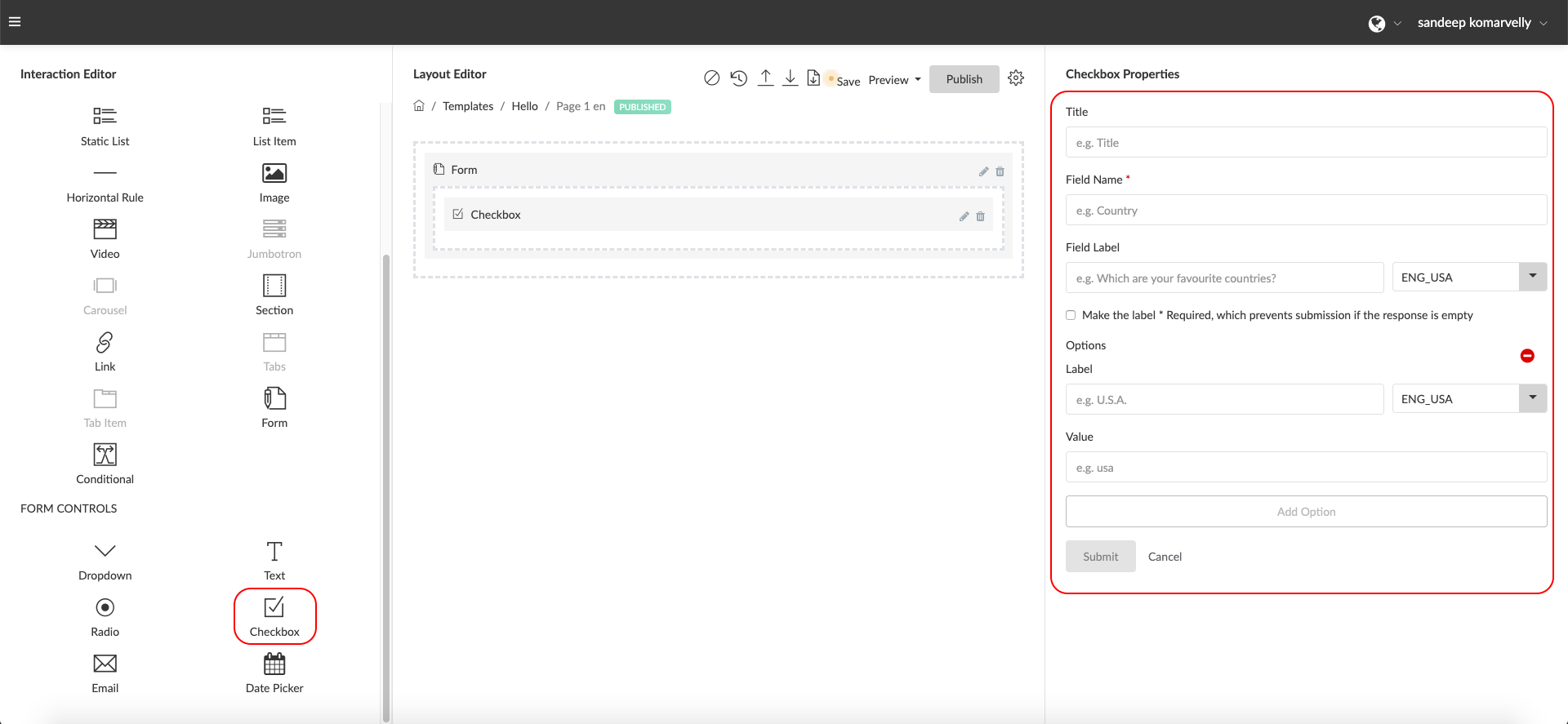
Properties
- Title: Enter a label for your Checkbox list within this field to help you identify the field or question (e.g. ‘Industries Field’). This is not displayed to end users.
- Field Name: Enter a field name without spaces or special characters to define a free form attribute to store the values input by the users. (e.g. targetIndustries ). This is used internally by the system and not displayed to the end users.
- Field Label: Enter a form field label or question the end user will see just above the text input. (e.g “Which industries do you target? Please select all industry segments that apply”). It is multilingual field
- Make the label * Required: Check this box if you would like to make this field mandatory.
- Options Label: Enter a label that will appear to the user for this Option (e.g. “Manufacturing Industry”). This will be displayed next to the Checkbox option and is seen by the user. Click on the multi-select field and select the language / languages you would like the text to be enabled for.
- Options Value: Enter the actual value sent to be stored in the responses data when the user selects an option. (e.g. “MANUFACTURING”). The value can be the same as the label or different if you wish to store a different value for the response within the data.
Thing Update Request Forms
The Thing Update Request Forms can be used to create a form that can actually update or patch data attributes within a Thing Instance. For example, if your Entity Data Model has a section with attributes related to ownership of a product, you can create a form that the end user can use to fill in these attributes with their ownership information and those values will be written back and updated to the Thing data.
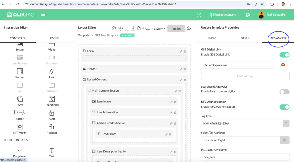
In order to create a Thing Update Request Form, first click on the “Update Template” Settings icon to go into the Template Properties. Then, click on the “Advanced” tab.
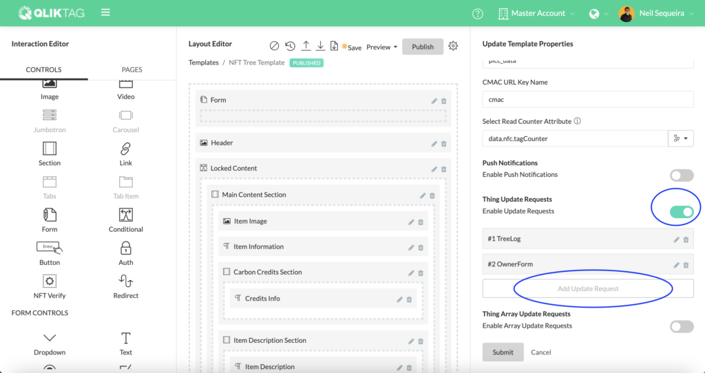
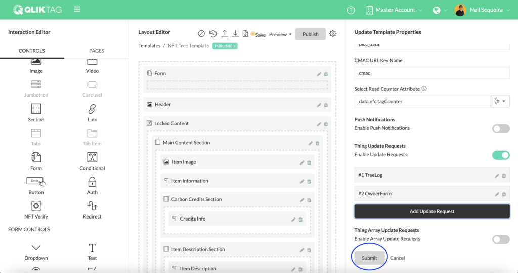
Scroll down to the “Thing Update Requests” setting and turn on the toggle button for the Enable Thing Update Requests. Then, click the “Add Update Request” button.
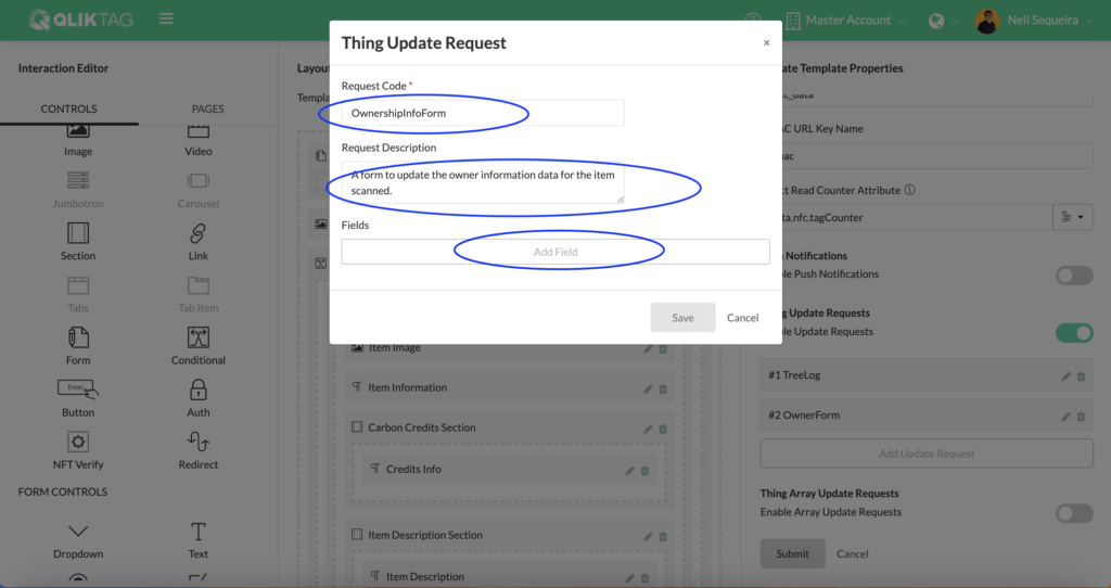
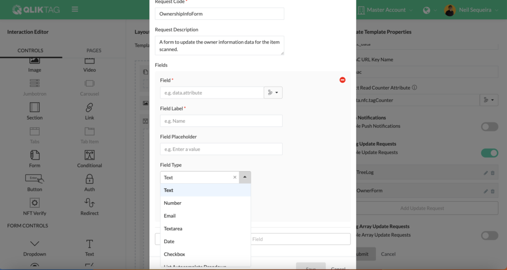
In the pop up screen that appears, first add a request code without spaces or any special characters in the code that you assign. Type in a description of what the form or data update request is for. Then, proceed to click the “Add Field” button.
Select the field or attribute that you would like to update through the form you wish to create using the attribute picker dropdown.
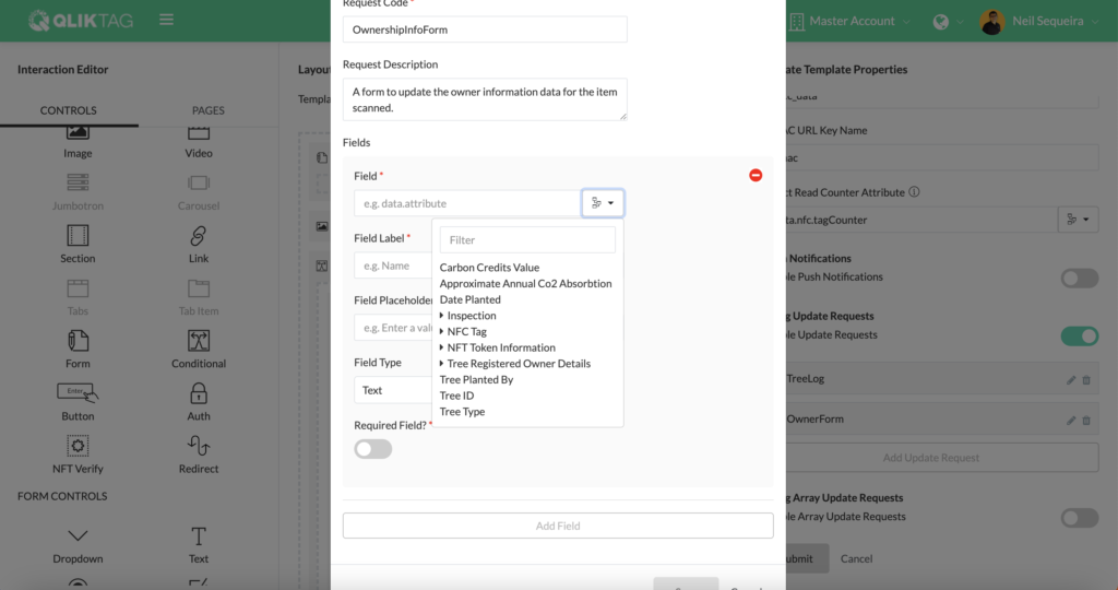
You can then edit the Field Label as you would like it to appear to the user within the form.
Add Field Placeholder text if you would like to show examples of data and help the user fill in the correct values. This is optional.
Then select the Field Type. This selection will determine what control is displayed on the form whether a text input box for string fields, an email input box, a dropdown, a date and time selector, a larger text area or checkbox for boolean values. Note, the Field Type or form control should match the data type of the field so that an appropriate control is used to input the values through the form.
Repeat this process by clicking the Add Field button and mapping each field you would like to include in the form. Once you have configured all your form fields and mapped them, proceed with clicking the “Save” button.
Ensure you click the “Submit” button at the bottom of the Template Properties page to save the Template Settings.
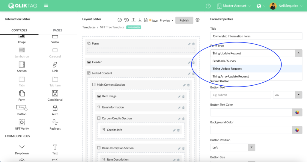
Drag and drop the “Form” control into the Layout Editor and select the “Form Type” as “Thing Update Request”
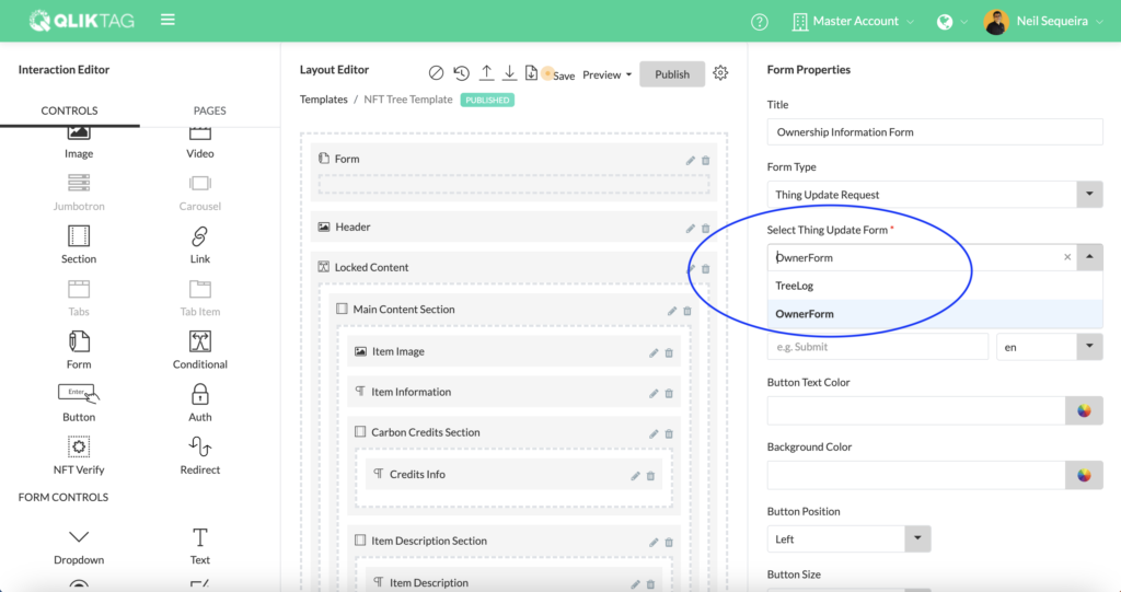
Select the “Select Thing Update Form” and select the form update request you created earlier.
Proceed with customising the form submit button label, button alignment, text color, background color and the message that will appear once a form has been successfully submitted. Once completed, click the “Submit” button, save the template and you should see the form appear within the preview.
